|
 
Home
Bio & Vision
Original Art
Limited Edition Prints Miniature
Prints
FAQ
Links
Contact Me
|
|
My Blog
Welcome, I put together this page so I can
share information about my paintings. Including info on the type of paint I use.
Some techniques that I have tried etc.
I also talk about framing, matting, how to
set up a studio and other tidbits that intrigue me. I hope you enjoy my site as
much as I've enjoyed making it.
What is Gouache?
Gouache (pronounced gwash) is an
opaque, water-based paint that is sold in tubes or jars. It is a
type of paint consisting of pigment suspended in water. Gouache differs from
watercolor in that the particles are larger, the ratio of pigment to water is
much higher, and an additional inert white pigment such as chalk or zinc white
is also present. As with watercolor, Gum Arabic is also present as a
binding agent. I
have used Reeves, DaVinci and
Windsor & Newton and find that all work well for me. Gouache dries quickly to a
smooth, matte finish, however dark colors will dry lighter than they appear when
wet, and light colors will dry darker. Although you can paint one color on
top of another and cover it completely, do this with care because gouache can
develop cracks if applied too thick. If you have paint remaining on your palette
you keep it for you next painting session. You can revive it by adding water to
it. I paint on a 140 lb. Arches cold press watercolor paper that I
stretch. The paint will scuff easily, be damaged by water marks or your finger
prints. I have recently started spraying my finished paintings with a
matte fixative.
5 Reasons Why Gouache Is Better Than
Other Paints:
• Because it is
more thick and opaque it is perfect for laying large areas of flat color.
• It is good for
creating paintings where rich, deep tones are required.
• Light colors
can be painted over dark without any hint of the underlying color showing
through.
• It can be
thinned down with water to give a translucency with is comparable to pure
watercolor and is used
the same way.
• The variety of
surfaces available to paint on increases dramatically when using gouache
compared
to watercolor.
Why I paint
I paint for many reasons, but mainly because it makes me
feel good.
As a kid I would draw & paint for hours. Went to Art School for Graphic Design
and ended up working in the printing field. Along the way I stopped painting.
After about 30 years I started painting again.
I don't paint on a
regular basis, but try to as much as possible. When too much time passes, I get
the urge to create, it’s like an addiction and I need to paint to feel
satisfied.
|
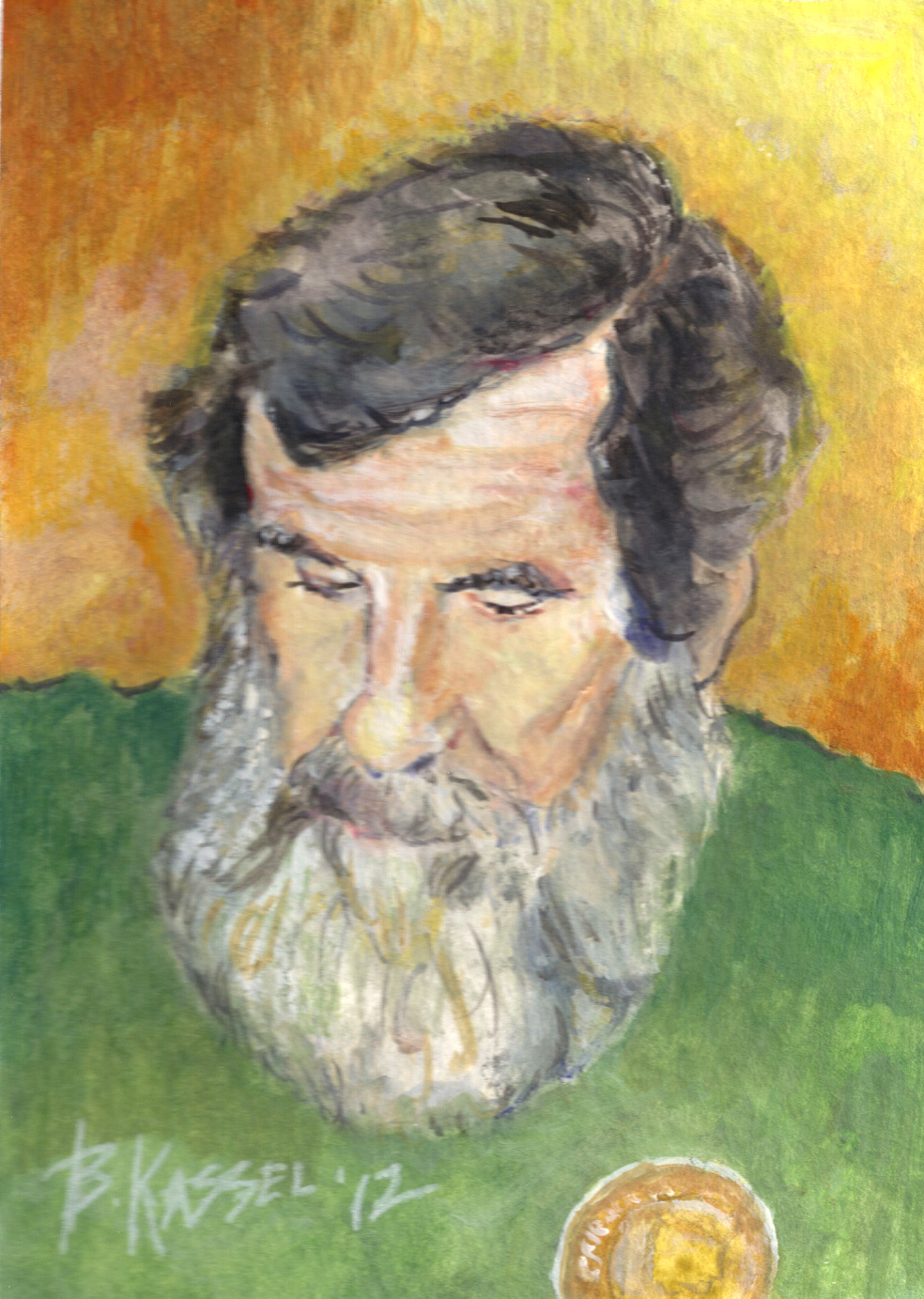
June 5. 2012 This was a
quick study of one the Rangers at Camp Horseshoe.
Medium - Gouache
5x7
140# Strathmore Watercolor
paper
|
| |
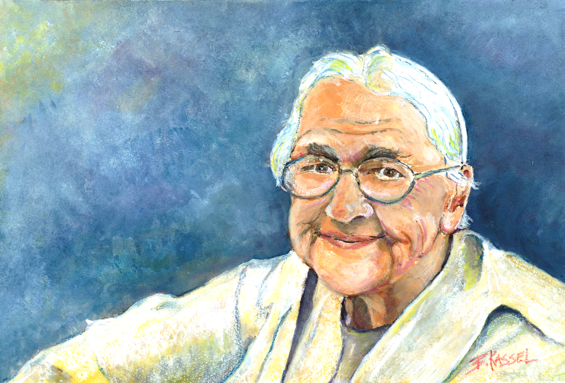
July 21, 2012 I met this wonderful older woman who was full of fun &
character. I asked if I could take her picture because I wanted to do a painting
of her. Here is the result of my painting. It took me about 7 hours to complete.
I look for subjects that have a lot of character whether they are portraits or
landscapes.
Size - 12 3/4 x 8 3/4 - Medium is Gouache on
140# Arches Watercolor Paper |
| |
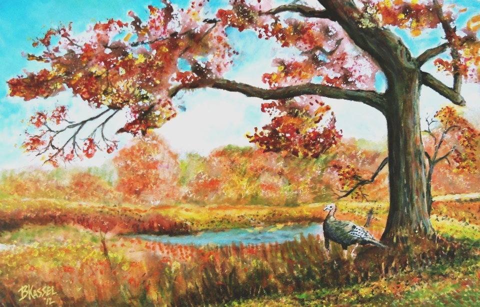
November 11, 2012 – Thanksgiving
Dinner 17 x 11 - Gouache on 140# Arches Watercolor paper.
I tried experimenting using a natural
sea sponge to do the foliage on this piece. It gave me a little more texture
while remaining loose. I found it to be very useful and fun. The application of
the gouache using a sponge work very well.
I starting
dabbing the sponge on the watercolor paper, making the tree shape. I created
lights and darks, then went in with a brush to add additional color and branches
to connect the dabbed areas before the paint started to dry. |
| |
|
How to stretch watercolor
paper
November 15, 2012
Stretching watercolor paper
keeps it from buckling while you are painting on it. It is not necessary for
300-pound paper, but lesser weights of paper will immediately start buckling as
soon as you add a wash to them. 300 pound paper is very expensive, so many
watercolor artists buy 140- pound paper and stretch it to a hard surface.
You need a hard backing surface to stretch the paper to. I use gatorboard. Gatorboard is basically a super-thick
piece of foam board. It's lightweight, easy to staple (and remove staples from),
and doesn't mind getting soaked, so it's perfect for this purpose.
Steps:
1. First cut the paper to the size needed.
2. Run the paper under cool water in the sink or bathtub, until it's wet
everywhere. Then let the water drain off of one corner until it stops running
and starts dripping.
3. Lay the paper flat on the board and smooth it out with the sides of my hands,
starting in the center and working my way out, pushing the excess water puddles
off the sides.
4. Let it sit for a few minutes until the paper no longer looks shiny.
5. Start stapling the paper to the board along the outer edges of the paper.
Start by putting one staple in the middle of each of the four sides, then work
towards the corners, a few staples on each side of the paper at a time, putting
the staples at the corners last. Use the side of your hand to smooth the paper
and pull it taught.
6. Let the paper dry thoroughly. You can use a hair dryer to speed up the
drying.
7. Tape all the edges with painters tape (I prefer Frog Tape) to keep water and
paint from running under the paper while you are painting. It also makes a nice
clean edge all around the painting when done.
Leave your comments or questions below...
|
|
Brushes
November 16,
2012
As far as brushes are concerned any brush that is suitable for watercolor can be
used with Gouache. Depending on the technique used and the finish required.
Sable brushes including synthetic sable are ideal. They are excellent in holding
a large amount of paint. They have ability to point and to spring back into
shape. This allows the artist to work fast and with more accuracy.
Bristle
brushes such as hogs can also be used if a more expressive brush stroke is
desired.
|
|
Gouache: To varnish or not
to varnish - November
19, 2012
As a personal
choice, I spray my finished art with Krylon workable fixative. I apply several
coats of spray varnish. I feel it brings out the original brilliance as it look
when the paint is wet and gives it an even finish. I also use the workable
fixative while painting if I need to isolate an area so I can paint over it
without re-activating the previous coat of paint. |
|
Picking the Right Mat Color - November 20, 2012
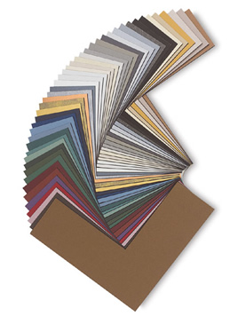 If
you choose to use one mat, we suggest using a neutral color. Any neutral tone
will enhance your art, but some will stand out and scream, "Pick me! Pick me!"
so play with a few before simply going with White. If
you choose to use one mat, we suggest using a neutral color. Any neutral tone
will enhance your art, but some will stand out and scream, "Pick me! Pick me!"
so play with a few before simply going with White.
If you plan on
using a double mat, one way to go is to use a neutral color on top, and for the
"reveal," (the inner mat closest to your artwork) punch up the color by matching
the mat to a dominant color in the artwork. This high-contrast treatment will
add new dimension to your presentation.
One of the most important aspects of custom framing is the selection of the mat.
Picking the right color is so important to the finished look.
The right colored
mat can make your picture pop, bringing out the flattering tones and hues. The
wrong colored mat can make your photo look washed out, discolored or bland. With
a little forethought, you can select a mat that will completely complement your
picture.
Choose a
selection of mat colors from the color group that achieves the look you want.
Select colors that complement or contrast well with the predominant color in the
art and keep the frame in mind as well.
Lay the mats on
your picture, one color at a time. Examine the picture for the tones and hues
that the mat brings out. Notice how placing the photo on different colors in
turn makes it look completely different. For example, a blue mat might bring out
the blue eyes of a person in a close-up portrait, while a red mat might make
some blotchy discolorations of that person’s skin look more prominent. Select a
mat that makes the colors in the picture look natural and flattering.
Choose the color mat that looks best with your picture.
|
|
DIY: How to Mat Your Own Prints - November 29,
2012
As a
struggling artist,
you've probably encountered the high costs of having your first pieces framed
and matted. And if you're thinking about doing a show, you may be anxious about
the costs associated with matting all of your art. Don’t let that scare you. All
you need is a simple, inexpensive frame,
and to learn to mat your own prints. With the right mat color you can make any
piece of art a show piece.
Here is a list of materials you will
need:
-
a mat cutter
-
a piece of acid-free matboard
-
your frame
-
a pencil
-
a box cutter
-
a straight edge ruler (metal)
-
Metal T-square (optional)
Here are the steps:
-
Using the box cutter cut the size
mat you need based on the size of your frame. If your frame came with a
paper insert, that is a nice guide to use when cutting. From this point on
always work from the back of your matboard so you don’t mark up the front of
it.
-
I usually mat my artwork with the
same size border all around. You could make the bottom border a little
larger to give the piece visual weight. Mat borders should be a minimum of
2” wide.
-
On the back of your mat, draw
lines with your pencil to mark where the window will be, extend the lines to
the edge of the sheet, so you can see where the corners cross.
-
Line up your mat cutter on the
guidelines you marked. Position the mat cutter so that the angled blade is
pointing toward the center of the artwork. Overcut each corner by about
1/16" to ensure that you get a crisp, clean corner. Push hard enough to make
sure your blade is cutting through to the front of the mat.
-
After you’ve cut all four sides,
your window should just slip right out. Put your mat into your frame, and
your artwork behind the mat. Repeat above if cutting a double matte. Adjust
opening size to allow a minimum of a ¼” reveal. Using an archival double
face tape to mount the 2 mats together. Then tape your artwork with a small
piece of archival tape on the top side to the back of the mat. Do not tape
all around. This allows the paper expansion and contraction do to humidity
changes.
-
Place a backing into the frame to
hold the mat in place, hold with framers points.
-
Now for a dust seal. This is simply a sheet of Kraft paper that
is glued to the back side of the frame for
protection.
-
Using
d-rings to hold the picture wire, install them about 1/3 the way down from
the top.
-
The final
step is to cut your hanging wire and twist it in place through the loop of
the d-ring.
|
|
My Thoughts on a Home Art Studio -
December 7, 2012
Art studios
are very personal. They are as unique as the artists who work in them. All
studios still need the same basic necessities. No matter what your personal
tastes are.
The following
is a list that contains the five “must-haves” geared toward a painter’s studio,
but the majority of these suggestions will also work for any artist’s studio.
For those thinking about setting up a studio, here’s what you’ll need:
1. Work Surface
The work
surface is the most essential part of your studio. Your work surface can be a
traditional easel or it can drafting table or even a desk.
There are 2
main types of easels.
A-frame
easels are good for smaller studios as they are able to fit snugly in the corner
of a room, but they can limit the size and weight of canvas, board or watercolor
paper you use.
H-frame
easels are larger, heavier, and sturdier than most A-frames. They allow for
bigger canvases and have forward-tilt and crank adjustments—which may be
overkill for smaller studios, of course.
2. Storage space
Every artist
needs space to store art supplies. Use a tackle box or even a set of plastic
storage containers. Old bookcases or shelves make excellent storage, also.
You might
also like to have a small table to hold your brushes and paints as you work.
Storage for
finished paintings doesn’t need to be in your studio. Put them in another room
of your house, or even on the walls.
3. Good lighting
Natural light
is the best light to paint by, so pick a room with large windows on the north
side of your studio that is the best choice. However if you don’t have large
windows, or you want to paint at night, you still need the best lighting
available.
Do NOT
use incandescent lighting in your studio! Incandescent lights gives off a yellow
glow that is not even close to natural color.
Color-corrected fluorescent lights – are much whiter and mimics natural light
closely. Also, do not under any circumstance buy halogen bulbs. While great for
photography they get every hot and can cause damage to your paint, your models,
your props, and anything else in your studio.
4. Ventilation
Good
ventilation is especially important for oil painters, it is also important if
you are varnishing or spraying fixative, but even if you don’t deal with fumes
every day, it’s great to have fresh air in your studio.
All you’ll
need are a few windows with screens and a couple of cheap box fans to help
circulate the air.
5. Running water
Clean up is
always easiest when there’s running water in the studio or at least close by.
It’s a great idea to keep paper towels, sponges, and other cleaning supplies
close at hand.
|
|
My Palette Colors
– December 14, 2012
Titanium White, Cadmium Yellow Light,
Cadmium Orange, Yellow Ochre, Cadmium Red Light, Venetian Red, Violet, Cobalt
Blue, Cerulean Blue, Phthalo Blue, Phthalo Green, Sap Green, Burnt Umber, Paynes
Gray. This is the order in which I place the colors on my palette.
(Notice there is no black on my palette.) It is better to mix your own black
(chromatic black), it will be much richer looking. Black from the tube is just
too black & will muddy the other colors. A chromatic black is created by mixing
dark versions of other colors, typically a red and green or blue and red. (I
also use Dr. P.H. Martin Bleed proof white for high light areas.
Keep a spray bottle filled with water
to keep your gouache paints moist. I keep a small wet sponge inside my
gouache palette when I'm not working with it. Change your water container
often. You might want to try using two water containers. Clean water keeps you
colors vibrant and not muddy. |
| Using glycerin as
a glaze - March 19, 2013
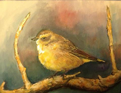 Did
a little experimenting and learned something new while painting a new wildlife
painting “Palm Warbler. I tried mixing glycerin using it as a medium with
gouache and found out that you can do glazes over dried gouache. It gave some
punch and brightened up the colors. It also slows down the drying process and
gives you more blending time. Definitely something I'll try again. Did
a little experimenting and learned something new while painting a new wildlife
painting “Palm Warbler. I tried mixing glycerin using it as a medium with
gouache and found out that you can do glazes over dried gouache. It gave some
punch and brightened up the colors. It also slows down the drying process and
gives you more blending time. Definitely something I'll try again. |
|
Creating symmetry and balance
in your painting - April 30, 2013
First thing to remember is there are no clear
cut rules. Creating symmetry and balance in paintings is basically an eye and
gut instinct. Some things just look awkward. If it looks awkward it’s wrong. I
feel an important rule is not to center the subject or squeezed it into a little
corner.
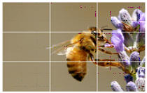 There
is a simple rule in contemporary painting composition known as the Rule of
Thirds. This principle of composition has been used for centuries by painters,
photographers and other artists. If you have a digital camera, a Rule of Thirds
grid is built into many digital cameras and it can be turned on and viewed on
the LCD. There
is a simple rule in contemporary painting composition known as the Rule of
Thirds. This principle of composition has been used for centuries by painters,
photographers and other artists. If you have a digital camera, a Rule of Thirds
grid is built into many digital cameras and it can be turned on and viewed on
the LCD.
Using this rule the
main subject is placed off center, away from the middle of the frame. Giving a
more dynamic and interesting feel.
Imagine two horizontal
and two vertical lines trisecting an image with four intersecting points. You
place your main subject where the lines intersect rather than centered in the
frame.
Placing the horizon on
an upper or lower line helps create a well-composed landscape. Placing a person
where lines intersect vertically produces a more powerful interesting look.
A Rule of Thirds grid
is built into some digital cameras. It can be turned on and viewed on the LCD.
To get the composition right it is important to
do some thumbnail sketches first. Mapping out your composition ensures you can't
go wrong.
|
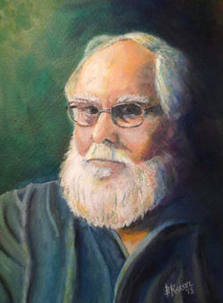 Self
Portrait Study - July 14, 2013 Self
Portrait Study - July 14, 2013
This was an exercise in light & shadow. I
also want to show that while painting white hair there are many colors making up
the highlights & shadows. I used a watercolor medium with water to mix the right
consistency of the paint. The more watercolor medium the slower the paint sets
up giving ample time to blend the colors.
I used gouache on 140# Canson watercolor
paper.
|
Here is my
best 'recipe' for flesh tone colors: - July 26,2013
1. Titanium white
2. Cadmium Red Light
3. Cadmium Yellow Medium
4. Yellow Ochre
5. Burnt Sienna
6. Burnt Umber
7. Ultramarine Blue.
Also have
Payne’s Gray on hand to darker tones
For light
flesh tones use colors 1, 2, 3, and 5.
For medium flesh tones use 2, 3, 4 and 5.
For dark flesh tones use 2, 5, 6 and 7.
Don't waste
your money buying ready-made, so-called flesh tints. Simply mix some white,
yellow or golden ochre, and a strong red such as cadmium red. Keep the amount of
red to a minimum to avoid going too pinkish. For darker tones, add some Payne's
grey.
All you have to do is remember this-"Red, yellow, brown, and
white-that is how you mix your skin tones right."
|
|
Painting with
Acrylic Paints –
July 29, 2013
You will need
some basics to start painting with acrylics.
-
A set of
acrylic colors to include the basics: red, blue, yellow, white and burnt
umber are fairly basic. You can add colors as you paint more. Starting with
a limited palate will help teach you how to mix different hues.
-
Start with two
or three different brushes: A round bristle brush, a flat edge brush and a
rigger for detail. You will want to add different size brushes to your
collection as you progress
-
A pad of paper
palettes that you can throw out after using.
-
A small table
easel
-
Canvas, canvas
board, gessoed masonite
-
Lots of paper
towels
-
A spray bottle
to keep the paints from drying out
Properties of
Acrylic Paints
Acrylic paints
are extremely versatile and work on a variety of surfaces.
Acrylics dry very
fast, so you keep your spray bottle handy to give an occasional spritz. There is
one product on the market called Golden Open Acrylics. These Stays wet longer
allowing more time for blending.
Since Acrylic is
a water-based paint, you can use it like watercolors, and make transparent
washes. You add more water to the paints and you have a watercolor effect. There
are many mediums available to use with acrylics to create different surfaces and
textures, to slow the drying time, and create a gloss or matte finish. Just keep
experimenting while you learn how to paint with acrylics.
Care of Acrylic
Paints
You can keep
acrylic paint usable for a few days. You can give the paints a good spraying
with water and cover with a wet towel. You can put your palette of paints in
fridge overnight, but make sure the paints are well covered.
Make sure to the
cap securely to keep the paint fresh.
|
Tips for entering Art Shows, Juried
Exhibitions & Competitions - April 3, 2014
There are many things artists should consider
before entering art contests, competitions, and juried exhibitions:
- Is the event local, regional, national, or
international? The larger the pool of artists, the harder it will be to get
accepted into the show, but the prizes are generally higher.
- Does your work meet the guidelines for theme, medium,
size, weight, and presentation requirements?
- Are you required to send a bio, artist's statement, or
other credentials with your submission?
- What are the fees? A small entry fee is acceptable, but
artists should be weary of vanity galleries which charge exhibition fees,
reception fees, or promotional fees.
- Ask who will be judging the competition. What are their
credentials? What is their affiliation with the organization
sponsoring/hosting the event?
- Will the art be juried/judged from slides or actual
work? If the art is juried from slides or digital images and your images
aren't of professional quality, you will be at a disadvantage.
- What type of awards are given? Are purchase awards
(whereby your work is sold for the amount of the award) worth more or less
than the sales value of your work?
- How many works may be accepted per artist? Acceptance
may be limited to one work per artist even though multiple works may be
submitted. Also, because venues often have a limited amount of space,
smaller works may be favored.
- Must all works be available for purchase?
- What commissions are taken on sales? Will commissions be
taken on purchase awards?
- Who is responsible for paying sales tax on art sold at
the exhibition?
- Where will the work be displayed? How will the exhibit
be promoted? Be wary of events that are only promoted toward artists, rather
than toward buyers, collectors, and the public.
- Do you retain all copyrights for your artwork? Or does
the promoter intend to use artists' images in printed publications, etc.
- Does the organization hold such events annually,
monthly, etc.? Annual events tend to be larger, better promoted, and more
prestigious. Be wary of sponsors who promote an annual drawing competition
one month, an annual painting competition the next, and an annual sculpture
competition the next.
- Is information available about the attendance or sales
from previous exhibitions? (Keep in mind that purchase awards may be
considered as sales.)
- Will the gallery or other place of venue insure the work
while it is on the premises?
- Does the chamber of commerce (in the city or county
where the event takes place) know anything about it or have any info on the
business or organization hosting the event?
All of that said... consider what you want to get
out of entering juried art shows or fine art competitions:
- If your goal is to build your artist's resume, look for
the most prestigious shows (also the hardest to get accepted into). Ask how
many artists have entered previously and how many of those artists were
accepted into the exhibition.
- If your goal is to sell your work, choose the art shows
that are heavily promoted to buyers, collectors and the public or ones that
have had the most sales in the past. Keep in mind that entering art contests
is a great way to gain exposure for your work even if you don't make an
immediate sale. Always have brochures, business cards, or postcards of your
work available to encourage future sales.
- If your goal is to win an award, find out as much about
the judge/juror as possible --what he or she looks for. What kinds of work
have they selected in previous art shows? They will probably be more apt to
have discriminating taste in their area of expertise.
|
|
The Most
Common Problem
-
April 3, 2014
90% of the time, the values or colors are weak, if you darken the dark areas and
make the lights lighter, suddenly it will give that much needed punch.
|
|
|
|
What is involved in a "semi-custom framing job" - April
22, 2014
|
|
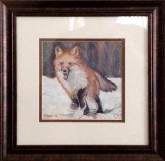
Semi-custom
work involves adding a custom-cut mat to a readymade frame. Most
readymade frames come with inexpensive glass that offers no protection
from harmful UV light and acidic cardboard backing boards. Upgrading to
UV-filtering glass and acid-free backing will help protect your
investment for many years.
We may also be able to help you re-use a frame that you already own.
This may or may not be cost effective for you. If your frame is in bad
repair or requires extensive clean-up before it can be used, the
additional labor involved may offset any savings. We can only determine
this on a case-by-case basis by examining the frame. Estimates are free.
If your art or photo is not a standard size, cutting a custom mat to fit
your choice of readymade frame can be a cost saving measure.
Do you have a frame you would
like to reuse? I can make an evaluation to see if the frame is in good
repair and appropriately sized.
|
|
| |
|
Tips for Hanging Art - April
22, 2014 |
A number of years ago I read about a great tip that to this day has
made picture hanging a simple, pleasurable task. The tip was to
always hang your art at 57" on center. "On center" means
that the middle of the picture is at 57" (obviously, the hook will
be higher). Interestingly, the 57" standard represents the average
human eye-height and is regularly used as a standard in many
galleries and museums...
What WE have discovered is that if you stick to
this standard, you create a harmony among ALL the pictures in your
home, as they will always hang in relationship to one another from
their centers, not their sides. Additionally, we have also found
that this helps solve the problem many people have, which is that
they hang their pictures too high.
Step By Step:
1. Measure and lightly mark 57" on the wall
2. Measure top of your picture to the middle (or take height and
divide by 2)
3. Measure top of your picture to the tightened wire (a small
amount)
4. Subtract this last amount to tell you how far above 57" your hook
should go
5. Measure up from 57" with this last amount and lightly mark on the
wall
Example:
1. Picture is 20" tall
2. Middle is 10" down from top (this should rest at 57")
3. Wire comes to 2" below the top
4. 10" - 2" = 8"
5. Lightly mark 8" above your first mark OR 65" on the wall
Though this may seem complicated to read, it is
quite simple when you do it. The thing to always remember is that
the CENTER of all your pictures are hanging at the same 57", and you
are just figuring out where the hook goes above it.
This 57" also applies to groups of pictures.
Think of a group as ONE picture. After you arrange how you want them
all to hang (doing this on the floor makes it easier), start with
the center picture/pictures and get them at 57" on center. Then
surround them with the rest of the group.
|
|
|
How to photograph your
artwork - as explained by Scott
Burdick October 22. 2014
Whether you want to make prints of your
paintings, share your work online or simply keep a record of a
picture before you sell it, it is important to know how to take
a professional photograph of a painting
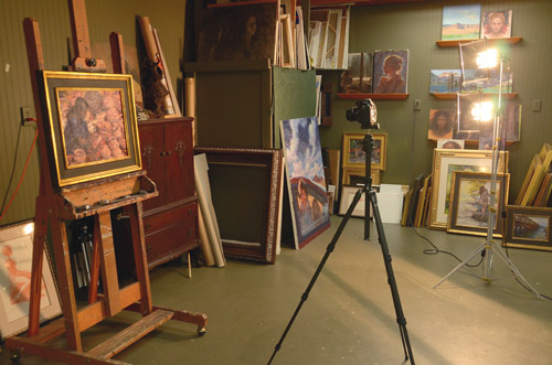
In this age of digital cameras, I’m often
asked how this changes the process of photographing artwork. The
main advantage of a digital camera is that you can review the
effect of your shot, the focus, the exposure, and any glare
issues immediately while you’re shooting, rather than waiting
days for pictures to develop only to find out something went
wrong. Combined with the ability to work on your photos
afterwards in software such as Photoshop, the ease of storing
and backing up your photos, as well as the ease of simply
e-mailing the image of your paintings to a magazine or show, all
make me very lacking in nostalgia for the days before the
digital revolution.
But with that said, the basics are still the same as they were
with older film cameras. There are many different ways to shoot
a painting, but I’ve attempted to explain the set-up I generally
use, which is a method known as “cross polarisation”.
The reason I use this system is because I often paint rather
thick oil paintings that can have significant glare issues when
photographing.
If you aren’t an impasto painter or you work in a flat medium
like watercolour, you might not need such an advanced set-up but
hopefully you will pick up some tips along the way.
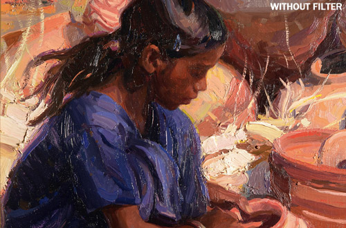
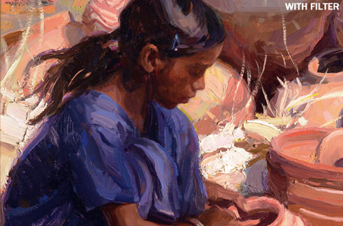
THE IMPORTANCE OF FILTERS
These two close-up shots of my painting show the importance of
using linear polarising filters. The painting at the top is
obscured by glare hitting the surface, while the shot below,
taken with a filter, is much cleaner and more professional.
THE EQUIPMENT
The camera
Any good camera, digital or traditional, will work with this
set-up. I happen to use a Nikon D7000 digital SLR camera with a
50mm lens. The reason I use a 50mm lens to photograph artwork is
that it has less glass internally than a compound zoom lens,
which means it will give you a sharper image. It is fine to use
a zoom lens – just make sure to look at the numbers on the lens
to make sure you are zoomed to around 50mm or above. If you us
as smaller number, say 35mm, then such a wide-angle will distort
your painting outward and you’ll see the straight edges of the
frame curve and bulge toward the edges, distorting the finished
photo of your painting.
The filter
I use a linear polarising filter over the lens. Do not use a
circular polarising filter, even though they are more common
these days (because they work better with autofocus). No matter
what the camera person at the store tells you, you want to make
sure you get a linear polarising filter or it won’t work
properly and will leave large portions of your painting full of
glare. I find the autofocus usually still works fine, but if
not, just manually focus.
The lighting
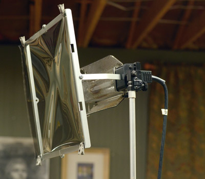 I
use two 500-watt tungsten (3200K) lights – any tungsten light
will work, so don’t think you have to get the particular ones I
have. I choose such powerful lights because the larger the
painting, the further away the lights have to be to avoid “fall
off” (in other words, one side of the painting becoming darker
than the other). I
use two 500-watt tungsten (3200K) lights – any tungsten light
will work, so don’t think you have to get the particular ones I
have. I choose such powerful lights because the larger the
painting, the further away the lights have to be to avoid “fall
off” (in other words, one side of the painting becoming darker
than the other).
If you’re shooting smaller paintings, you can get away with a
single light or lower wattage. The polarising filters cut down a
significant amount of the light reaching the camera sensor as
well, which is another reason to have a good, strong light.
The gels
If you are using a linear polarising filter, these will hang in
front of your lights. My lights came with optional frames with
clips that make it easy to hang the gels in front of the light,
but I’ve seen people rig up the same sort of thing with wire or
coat hangers.
The tripod
You will want to always use a tripod with this set-up, since
you’ll have to use very slow exposures when shooting with
polarising filters.
THE PROCESS

1. Position your lights
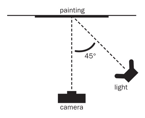
Make sure the lights are positioned at approximately a 45 degree
angle to the painting you’re photographing. I put both lights to
one side so I get a slight shadow on the brushstrokes. You can
also put the lights on opposite sides at 45 degree angles, which
will flatten out the texture and might be good if you have
wrinkles in paper, or crackling on an older painting. As a
guide, I generally position the lights about four metres away
from the painting, when shooting a painting measuring around
75x100cm.
The important thing is making sure the gels are not too close to
the lights, which can warp or melt them, and that the
polarisation lines etched onto the surface of the gels are both
aligned in the same direction.
This is easy to check by simply holding one gel over the other
one and rotating them. When they become transparent, they are
aligned; when they turn black, they are out of alignment.
Try to shoot at night, or else choose a room in which you can
block off all other light sources (e.g. windows), since anything
that is not polarised at the 45 degree angle will give you
glare.
2. Set your camera
I would suggest using the manual mode for setting your exposure.
I generally shoot at about a five-second exposure with a focal
length of around f/10, which gives me a little extra focus depth
to make up for any error I might make in focusing.
Always use the lowest ISO setting on your camera (usually ISO
100), since this will also give you the sharpest picture
possible – the ISO setting traditionally refers to the
sensitivity of film and in digital cameras it also refers to the
sensitivity of your image sensor; the higher the ISO number, the
grainier the image will appear.
Remember to use the tungsten white balance setting on your
camera – on most cameras, the symbol for this is a light bulb.
My camera also comes with Kelvin setting, which you will want to
set at around 3200K.
3. Take your picture
Simply look through your viewfinder and rotate the polarizing
filter on the front of the camera lens until you see the
painting darken slightly and the glare magically vanish!
If you are having difficulty seeing exactly when the glare
disappears, move the camera closer to the painting to adjust the
lens filter. Once the filter is adjusted properly, you won’t
have to change this setting when you move back or shoot
additional paintings.
When taking the picture, I use the camera’s timer set at two
seconds so I can press the shutter, remove my hand, and then
wait for it to start the exposure. This means I don’t have to
worry about my hand jostling the camera and creating a blurry
image.
|
|
Starting a painting with a toned
background -
January 12,2015
Toning the surface of paper, canvas, board, masonite is a
very important part of the process of painting.
Not all artists like to paint on a white surface. It is done mixing paint
with water for water soluble paint or turpentine for oil based , applying it
with a cloth or brush. This way you can add a background color that not only
gives a starting common color that helps unify the work, especially by leaving
small patches of the background throughout the picture thus preventing other
colors from becoming too dominant.
The most common toned background colors are earth tones. This practice also
eliminates those distracting little white dots showing through the paint. These
dots are particularly annoying in darker areas of your painting. Additionally,
artists that paint on white background, have the tendency to paint in light
values. The simple reason for that is color interaction.
|
|
|
|
|
|
|
|
|
|
|
|
|
|
|
|
|
|
|
|
|
|
|
|
|
|
|
|
|
|


 If
you choose to use one mat, we suggest using a neutral color. Any neutral tone
will enhance your art, but some will stand out and scream, "Pick me! Pick me!"
so play with a few before simply going with White.
  Did
a little experimenting and learned something new while painting a new wildlife
painting “Palm Warbler. I tried mixing glycerin using it as a medium with
gouache and found out that you can do glazes over dried gouache. It gave some
punch and brightened up the colors. It also slows down the drying process and
gives you more blending time. Definitely something I'll try again.
 There
is a simple rule in contemporary painting composition known as the Rule of
Thirds. This principle of composition has been used for centuries by painters,
photographers and other artists. If you have a digital camera, a Rule of Thirds
grid is built into many digital cameras and it can be turned on and viewed on
the LCD.
  Self
Portrait Study - July 14, 2013


 I
use two 500-watt tungsten (3200K) lights – any tungsten light
will work, so don’t think you have to get the particular ones I
have. I choose such powerful lights because the larger the
painting, the further away the lights have to be to avoid “fall
off” (in other words, one side of the painting becoming darker
than the other).